| |||
- HOME
- CHANNELS
News Channels
Site Sections
Highlights and Tools
- GOT NEWS?
Main Site
- Submit News
Or, Select a Staff Member
- Joey Barr
- Jay Shepard
Rebelscum Languages
- PHOTO ARCHIVE
Collectibles by Company
- Bandai
- Disney
- Disney Infinity
- EFX Collectibles
- Gentle Giant
- Hasbro
- Hot Toys
- Kotobukiya
- Sideshow Collectibles
- Others
Older Companies
- STORES
Rebelscum is a news and photo reference site for Star Wars toys and collectibles. We do not sell toys. Please support our site by shopping with one of our sponsors.
Recommended Stores
- BigBadToyStore.com
- Entertainment Earth
- Official Pix
Still can't find it?
- eBay
- RebelscumShop
- R2-D2 Parts
Cool Stuff
- Amazon
- Gentle Giant
- eFX
- REBELSCUM SHOP
- FORUM


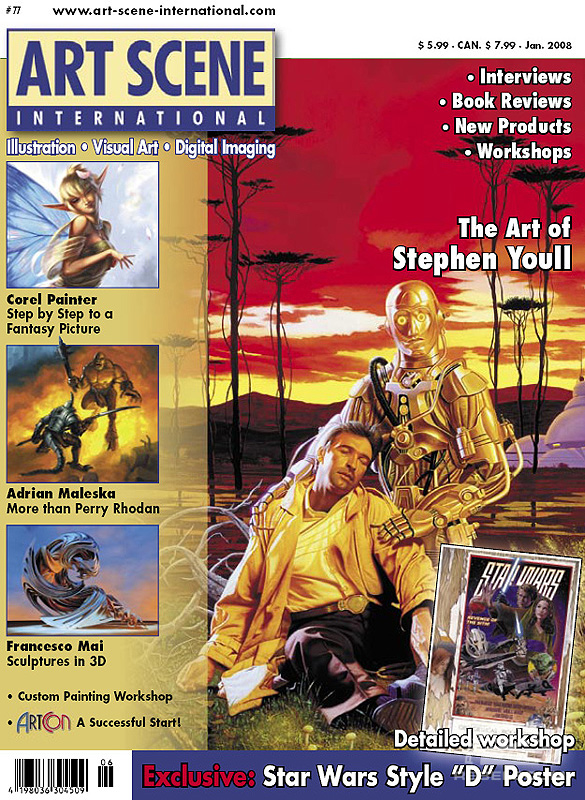
Includes an article by Pete Vilmur on the creation of the Revenge of the Sith Style 'D' Circus poster by Matt Busch, as well as an interview with cover-artist Steven Youll.
A super-sized preview for the story interior can be found by clicking on the preview image below.
The Circus Comes (Back) to Town
by Pete Vilmur
As a Star Wars poster collector, I’m often asked which poster would be the last to go if I ever decided to sell the lot of them, which easily consists of hundreds. Without question, my answer is always the same – the 1978 Style D. Commonly called the “Circus” poster by fans because of its retro big-top-genre look, I’ve always admired its ability to capture essentially what Star Wars is – a perfect mix of old-world adventure, new-world technology, and classic craftsmanship. I also loved the inventiveness of the design – the “pasted-on” look was actually devised ad-hoc to accommodate the credit block at the bottom, producing an aesthetically perfect composition. For me, artists Charles White III and Drew Struzan struck the gold standard for all that a movie poster should be.
But it was an anomaly – no other Star Wars poster even attempted to approach the spirit of the Style D, since marketing of the films had taken a different tack in its subsequent print campaigns. But with the saga complete and the final chapter – Revenge of the Sith – reclaiming some of the luster of the original trilogy, I thought the time was right to resurrect the Circus poster.
I wondered how the original D composition might look if Luke and Leia were replaced by Anakin and Padmé, with a younger, perhaps Obi-Wan looking on from the fringe? And what if we kept the Star Wars logo at the top, and used the small blurb section in front of the characters for the title? Finally, what if we mirrored the composition so the two posters could be displayed together, book-ending the saga?
The concept nagged me for two years until StarWarsShop (Lucasfilm’s official online Star Wars store) asked me if I’d be interested in working with artist Matt Busch to come up with a poster design for them. The planets had aligned – I knew Matt was a top-tier artist who had the style and skill to pull off a resurrection of the Circus poster, and was a hardcore Star Wars fan to boot. The “Sith Circus” poster, which is what I’d called it in my first scribbled notes a couple years earlier, looked like it just might happen, and couldn’t wait to hear what Matt thought of the idea.